Showing posts with label The Wilsons. Show all posts

Friday, March 21, 2014

My Master Bedroom: Before & After

Our master bedroom was similar to the other bedrooms in the house, not much wrong but needed some color, the rim needed painting, and a more contemporary fan were among my top priority changes for the space. 

So here is the "Before": 


And here are the "Afters":


Personally, I love dark walls. I know the thought of a dark color on that paint swatch is intimidating, but it gives so much opportunity for drama, light, and contrast. All these elements make for a space full of interest. And dark walls in the bedroom means a dark space for sleeping... and I love to sleep! It's a very warm and comforting space. Everything in the room was transferred over from our old room in NC except for that long, tall mirror which was left in our "new" house and was actually made by the owner. They had it hanging horizontally in the den but it did not work there with our new configuration and I've always wanted a nice full length mirror in the bedroom, this one just happens to be an overachiever! I plan to have the window panels re-worked soon so that they hang from below the trim to the floor but that will be down the road. Can't do it all at once!


The dresser, chest, and nightstand were Matt's parent's. "Vintage" Stanley Furniture. ;) My night stand is a thrifted little Mid-Century piece that I revamped but I still to photograph that one! We stained our bed a few years ago to make it work better with our other pieces. We also added a more modern fan that or baby loves to watch ;) and the lamps are from Target. 


So here's what the floor plan looks like: 


You can see that we have lots of lamps and chose to have no over head light when we picked our new fan. I find that one overhead light usually is not the best choice in a bedroom and much rather have the option of have all my lamps on for bright light or be more selective with my light sources for a dimmer setting at night. 

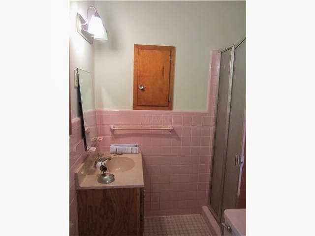
This room is a bit bigger than our previous bedroom yet still on the smaller side in terms of a "Master". It is an older house though so it's to be expected. We plan to gut the bathroom (which is not pictures but is all pink!) as well as re-egineer the closet. We will work with what we have and push the space to it's full advantage. Stay tuned!


Thursday, January 16, 2014

My 1950's Ranch: Foyer | Living Room | Dining Room MAKEOVER

This is my second "Makeover Post" for my 1950's Ranch. (If you missed the first, it was on our hall bath and you can check it out here.) I grouped three spaces into this post because they all somewhat lead in to one another so bear with me on the length. It's mainly pictures because that's what we really want to see. 

The entire home was pretty much as it was when it was built. Stained wood trim on both the ceiling and bases through out every room as well as all the doors. So we painted and we painted and we painted, and then we painted some more. (When I say 
"we" I mean my awesome husband, family, a friend who is pretty much a painting professional {thank goodness} and my {at the time } very pregnant self. I think that took the most time out of anything we did. (except for the Kitchen...but that's another story!)

So here are some "before's"...


 And now for the "After's"


So as you can see, the paint really brightens up the space. We also added another light fixture in the hallway so that helps too. A geometric runner in the hall also matches the rug in the foyer.


I used a bright turquoise blue in the foyer. The one wall that remains white will get a special treatment later on.  I chose black for the door's coat of paint and we replaced the stain glass with clear panes to give the door a fresh look. A vintage table greets you when you enter in... it was passed down from my husband's mother.  I thrifted the geometric mirror and painted it a mustard hue. The lamp was also thrifted and I covered the shade with a Dwell Studio geometric fabric that I had used on a chair in the adjoining space. The oversized "W" is a hollow cardboard letter that I spray painted with some silver metallic paint.


The living room is a mix of new and old. Some pieces are thrifted, some are retail, some I made, some I rescued and revamped, but my favorite pieces here are the Italian marble mid century end tables and coffee table that were my grandparents from when they got married. The art on the walls are prints of downtown Memphis that hung in my Papou's restaurant downtown for over 30 years. The bench in the corner now has a new home in the den, but that was a piece I designed and built while I was in design school.


Here are some process pictures...


The black shelf was made by my Mom and Dad as a Christmas gift for me years ago.


These chairs were Habitat finds (even the amazing faux tweed fabric was thrifted!) which I had recovered. The turquoise credenza was a craigslist find that I painted.


The Living Room and Dining Room are pretty open to each other, but the dark navy walls in the dining room  create a visible separation while allowing for the spaces to still be open.


The dining table was another piece passed down from my Grandparents, while the credenza was a thrifted rehab piece. 


(click on image to view larger)

Artsy gallery wall. The ferris wheel photograph was a picture I took during a summer visit to Santa Monica on the pier. The painting was a collaborative effort between my step daughter and I. My mom and dad made and painted the chevron frame that holds a picture of my step daughter Karmyn. I got the faux antlers at Hobby Lobby and spray painted them white. The gold artichokes are from design school. I used an artichoke as my concept for a project in second year and so I went out and bough the vegetable, cut it in half and set int on my desk to study its layers and to inspire my process. It actually didi not rot but dried out nicely, so I spray painted it and have displayed it on m walls ever since. The stippling drawing in the middle was one of my mom's art pieces from high school. The graphic print is a piece I created from a favorite quote that serves as a nice daily reminder.  It's a picture of downtown Memphis and features a some shops, one of which is a jewelry shop that years later would be where my Dad bought her engagement ring.


And that's the end of these spaces make over. Stay tuned for the next space!


Thursday, January 2, 2014

Hall Bath Makeover Featuring a Custom Countertop


This project definitely evolved over time. At first, I was simply going to paint the vanity, change out the hardware, and add a new light fixture. In a perfect world we would gut the space and start over, but with all the work we wanted to do on the house before we could even move in...that was not an option. But when we started working, we thought of a few more changes that could be made that would help this space be more suitable for us until a complete renovation could be made.

We painted the space in a light grayish blue that matches the tile which helps the tile kind of fade into the walls. It seemed like the best way to work with the tile until we can rip it out. We also painted the trim around the window and door frames as well as the doors. We also ripped out the blue toilet and nasty floor vent and added a fresh white toilet and shiny clean vent. It really helped freshen up the space.


A new shower and bath will be great...but while we are waiting to take that plunge there is no reason we have to stare at the etched swan sliding door. We pulled out the doors altogether and added a curved rod and this shower curtain from Dwell for Target. 

A custom shade in this great fabric softens the window.


There was no mirror or wall light at all, so we added this vintage walnut framed mirror from Stanley furniture that is actually a part of our bedroom suite that we weren't going to use (which you will see why in the future post on our master bedroom). 


I found this simplistic yet modern light at a discount store here in Memphis.
The ceiling light is a vintage piece my mom had thrifted and set aside for me.


The biggest change comes with the vanity. My husband, who started a concrete company when we moved to Memphis in the Spring, created and produced this amazing counter top. It was a labor of love...and I definitely love it. We have received a ton of compliments. I love the thickness of it and its rough and raw characteristics that contrast the sleek vessel sink and faucet. We added the piece of walnut as a backsplash after we decided that the tile toothbrush holder and soap dish had to go as they were just so bulky and took away from the vessel sink and faucet. The walnut conceals the void in tile, adds another texture, creates a nice juxtaposition of forms.  I painted the base an ultra dark chocolate and added some simple, modern hardware from ikea. The rug is a funky, chunky wool rug that has a shag feel in a nice blue that again works with the existing material.


I love the exposed aggregate in the countertop.


The last little detail are the bottles of sand in the window sill. I have had these sense college, they are glass bottles, each filled with sand from different beaches I have visited. My sister gave me the idea to add them to the space and I l think its the perfect final touch.

It is not "perfect" but we do love the  'temporary final' which will more than do until that big renovation can happen.

Our New Home...My Big Blank Canvas.

This post is long overdue. But you've got to start somewhere right? Back in the summer, when we thought we would never find the right home, we found this amazing house that had just landed on the market. We looked it the next day and were completely wowed. It was in the middle of Bartlett, a small town right outside of Memphis, but set back on a small quiet road filled with older homes on large 1-2 acre lots. The home had so much character and tons of potential. We put in an offer the next day and a month later it was ours. 
I started planning right away. The house was in great shape but was dated which was just fine with us.  I took dimensions, drew floor plans, and created 3d models. We spent months working on it and are almost done with the main first phase. I can't wait to share the progress posts with you. But for now here are some before's as well as some of the yard. We've got big plans for that as well! 


The entry foyer heading into the kitchen.


The living room facing the entry foyer.


Kitchen


The kitchen opening into the dining room


The dining room opening down into the den and the living room to the right.


The den which steps down from the dining room.


Bedroom 1 (which will be Karmyn's).


Hall Bathroom


Bedroom 2 (which will be the baby's nursery).


Master Bedroom


Master Bath


 Our lot goes back past that barn in the far back right of this image above.


There are three levels of patio/deck space in the back and tons of gorgeous plants. the past owners were avid gardeners.


The past owner built this deck by hand with a Arkansas field stone base. And how awesome is that huge tree the deck is built around?


You can't really tell from the front but the view from the back shows how big the house is... the bottom level is the basement!


One of my favorite elements is the amazing elongated bricks that the exterior is composed of. There is even an interior wall in the den with this material too!

So that's it for now...But stay tuned. The first before and after space post will be up soon! I really do promise.