Showing posts with label memphis interior designer. Show all posts

Monday, November 2, 2015

Bathroom Getaway

Once again I have disappeared from the blogging world, but I am trying hard to make a comeback. I thought I would share with you guys one of my latest projects that was recently completed. 
The project features a small master bath spaces that the owners wanted to freshen up and add a hint of the tropics to their small space. Their inspiration for the desired outcome came from their honeymoon trip to Fiji. They wanted to feel that getaway sensation every time they stepped into their space. Another factor they wanted to focus on was giving their bathroom a modern touch.

Check out these before's:


And here is what I came up with...


I kept the walls cool yet bright and added darker elements to lend to the updated modern feel the clients were looking for. I also introduced subtle color that also gave a beach vibes and incorporated lots of rich texture through fabrics, tile, and the rug.

Here are some 3d views I created to present my design to my clients.


They loved it! As a part of any design process, there were changes that came up a long the way and elements that had to be place into phase two, but for the most part we were able to see the overall design through and I am loving the outcome. Take a look for yourself!


I love it. But what I love even more is how much THEY love it. Want to know a secret? This was a client I worked with online only! That's right. We did everything from start to finish via email. It can be done. I'd love to help with your next project either in person or as an e-client. Let's get started!


Tuesday, January 27, 2015

Coral + Turquoise: Fabrics to Inspire

Oh hello again! Long time no see, I know I know. I am awful. I've got to get better! But new year, new goals right?
I've got a very special project I am working on and will share all the details later but here is a little teaser of some of the fabrics I am pulling together. Cute huh?

Stay Tuned!


Tuesday, May 27, 2014

Levi's Nursery

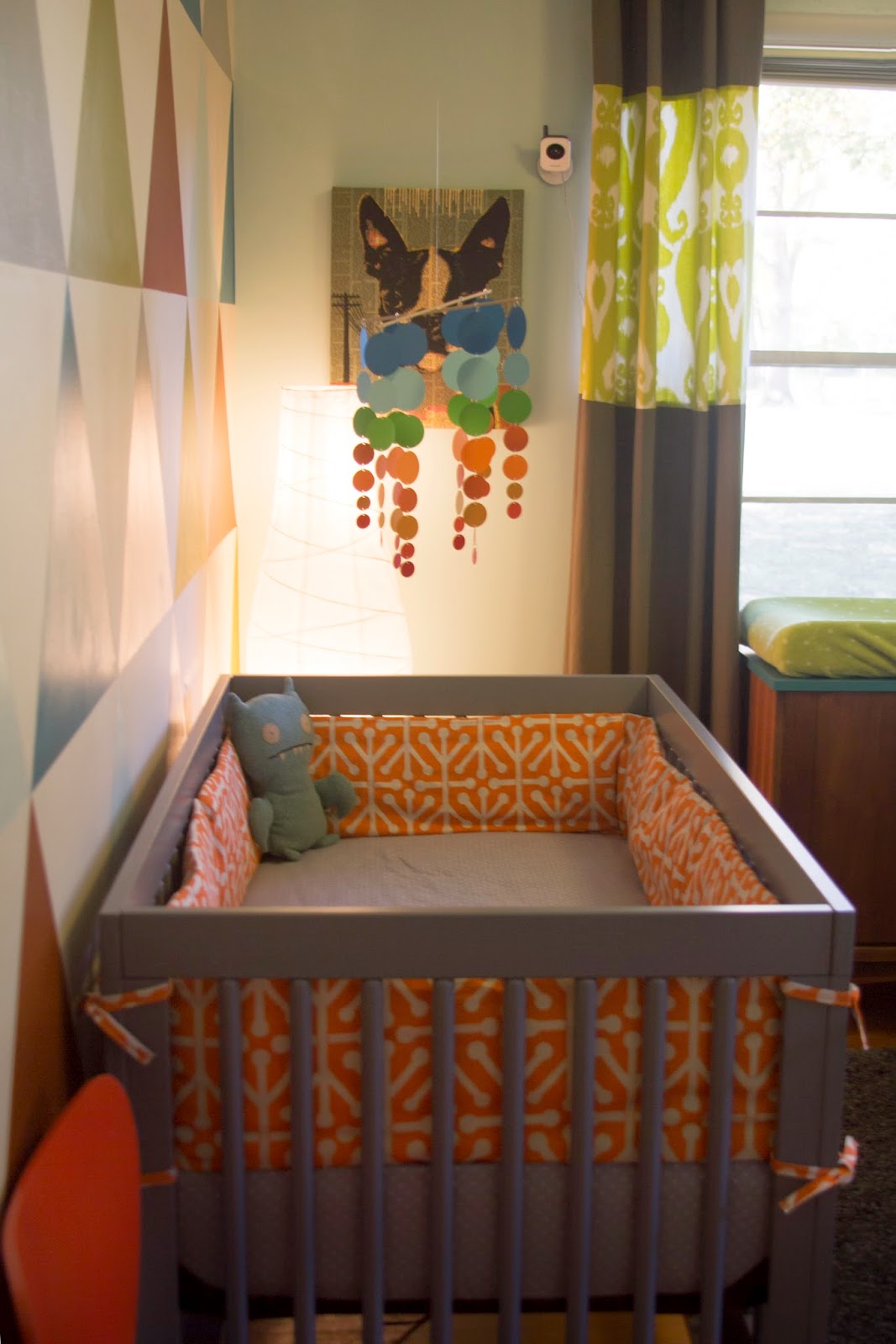
One of the most exciting parts of working on the house last summer was by far, designing and installing our baby's room. It was months in the making and something I've dreamed of and anticipated for years. I started getting the big pieces first and then worked on the color scheme, fabric selections, and wall graphic.  Art was also a big part of the space and I had a great time selecting just the perfect pieces. We also mixed in some sentimental pieces and gifts such as stuffed animals and books. All in all I feel like his room is a good mix of old meets new.  It's very "retro modern" and it came out exactly the way I dreamed of, if not even better.

This was my little design layout I came up with once I decided on the accent wall design and my fabrics. I also used it to brainstorm the color placement and where to put the fabrics I wanted to use.


So here's the plan....

My mom found this long bookshelf on the side of the road for free! We simply cleaned it up and painted parts of it in a shade of gray. The lamp was a thrift store find of my mother-in-laws and we covered the shade in a fun fabric that coordinated with the colors of the room, and the changing table was thrifted by my Mom. The top had been replaced by a piece of laminate so I painted it in the deep turquoise that we used throughout the room in accents. The panels were some I had from Ikea that we re worked with the green ikat fabric. The bumper pad was just a plain pad that my super Mom recovered with this great fun orange print fabric.
I love our crib. Its retro and modern and the color is perfect. The wall was not as hard as it looks! Here are some process pics...


The hardest part was determining the size of the triangles and drawing it out. After that I simply would tape off one color group at a time, paint them, and let them dry before going after the next group. It took about 2 evenings of work. The result was so worth it.

We got the rocker from Ikea. Its modern yet super comfy. We with the the white cushion and once again my super Mom stepped in and covered the existing cushion with our fabric. (seriously, what would I do without her?!)


The mobile was a kit we got off of Etsy.

How cool is this "diaper cake"?! Once again, thank Mom.


The bottom prints are from a great artist, Elouise Renouf from Nottingham, UK. Her work is very Mid Century and very cool. It was so hard to pick two!
The top print was created by my friends over at An Open Sketchbook. Suzanne and Edgar are uber talented designers and artists. Take a look at their work and you will be hooked. Suzanne was actually one of my professor's in design school! Here's a better picture from their site:

I love the idea of placing words of wisdom and good advice around him in his room. That inspired me to create a few pieces of my own, seen here below.


I love this space. Levi and I hang out in here everyday. I can't wait to watch him grow up in here.
And most importantly, Levi loves it too :)


Levi at 4.5 months
(Photos above by Pictures of Silver Photography) 

Levi at 6 months!


Tuesday, February 11, 2014

Bring It On Basement.


In our new home we were fortunate enough to have a basement! It is very raw and far from finished but that's ok because it's even more of a blank canvas to work with. It's not a full basement, but covers about half of the house. Right now we use it as storage space, laundry room, and a doggy playroom. I also have my desk and craft stuff down there too but since it's not heated and cooled it's  not the most enjoyable space to work in. There are two windows so it actually gets a fair amount of natural light. I'm down there ALL the time doing laundry and I can't help but think of how much more enjoyable this space could be (and will be!). My husband's not ready to jump into another huge project and I can't blame him. We have barely finished our move-in projects plus we have a little baby now but I can still dream and draw and plan!

The planning phase has officially begun. Hopefully soon I'll take measurements and draw up a floorplan to start some space planning but for now I'm working on some inspiration.  

Here are some elements I'd love to include in the renovation whenever that may occur :).


I love this wood slat treatment to the stairs. Right now our stairs leading down are completely enclosed so I think it would be nice to open it up. (Also, I'm loving the polished concrete floors but more on that later).


I really like the introduction of wood to this space. So fresh and simple. But what I like most about the space above is the ceiling. At first I wanted to finish out the ceiling, but after seeing so many great exposed rafter ceilings I'm starting to change my tune.


I've always loved these big, sliding barn doors. They've never worked for any space in our homes but could definitely work in our basement.


I love built-insand under the stairs is a great opportunity for doing something special. A little reading nook like the one above would be perfect.


I've also always loved these built in bunk beds and think they are so fun and such a great use of space. It wouldn't work under our stairs but possibly on a wall somewhere down there. I know they would come in use for sleepovers and house guests.


My family teases me for having (and using!) so many different light sources. But you use some for different needs and times of the day. I love the options and I love light! Lighting up the steps is awesome especially for little ones (and big clumsy ones) in the night.


Usually I am always about clean, simplified and modern design but I appreciate (almost) all genres. I do love earthy, reclaimed, raw elements... and I'm loving the idea of a wooden wall with reclaimed wood, old fence posts, wooden floor slats, or maybe even pallets. It adds texture and interest. Very cool.

And last but not least... we have the flooring. The floor is already concrete of course, but I'm ok with keeping it that way. We might stain and or polish it and I think that will add another great layer of texture and interest. Just add lots of cute rugs. :)

After my digging around through pinterest for all these elements that I'd like to see in our future basement renovation I then stumbled upon this great space. It too is a renovated basement, however it includes almost all the elements I am looking for and even the same types of spaces. So cool! It's a great precedent study for what works and what might not. But this whole space is just lovely. Check it out here.
 But here are most of the images for your viewing pleasure:


Hopefully I'll be able to update you soon... at least with some "before's" and some plans. I've got to space my projects out a bit to give my husband (and family) a break. :)