I love this room! It may be a child's room but I think it has so many attributes that I would use in a master or guest room.
Let me just tell you what I love about this space:
1.) Those great Jonathan Adler Giraffe lamps (as well as the fun Adler side tables)
2.) Ugly Dolls! ( I own 2 of them myself:) )
3.) Geometric wall covering ( I like how they used it only in that one space ( almost as if it were an extension of the head board)
4.) Sunny yellow highjack chair
5.) Fuzzy rug
6.) Graphic, high contrast, patterned curtain panels
7.) Metal wall letter
Monday, January 31, 2011
Tuesday, January 25, 2011
Designer Highlight: Lisa Wong Jackson
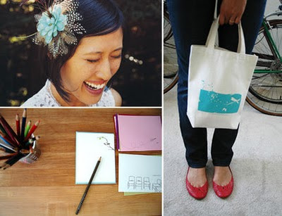
I stumbled across Lisa Wong Jackson's Custom Design + Stationarysite, Good on Paper, a few months ago and still cant get it out of my head!
Ive always loved cards and stationary since I was a little girl {I used to dream of working as a card designer for hallmark, a very long time ago :)}
Lisa's work is so...so beautiful! I love her use of white space, her magical line drawings, and her organic renderings. {I also love the fact that she has a boston terrier and his name is pixel :)}
Check out her work! You wont be sorry you did!
Monday, January 24, 2011
Breakfast Nook with Some Flexibility!
I love this idea! Placing a small sectional around your dining table to create a banquette type seating around the table ( like a cozy little breakfast nook ) with cute chairs surrounding the other sides. I like this, because its not as restricting as a built-in. I only have one dining table and I've always wanted to have a nook but not wanting to commit to the built in look. {even though in reality you could always rip it out, but that's too wasteful}. So the look + flexiblity of this setup is perfect (plus its another excuse to find a great sectional!} Maybe one day!
Saturday, January 22, 2011
Classic Chevron
Its no new news...chevron is in...{and i happen to love it!} Ive been seeing and reading about this hot graphic pattern everywhere. Ive decided this is the print that I want my pillows recovered in. I might even introduce this pattern in other parts of my space too! Love these spaces below...
{images for this layout i created were gathered from here, here, here, here, here, here, here, and here.}
Interior Exploration: the space {inside} the space
I love nooks. [niches, dens, retreats] So one fad Im loving in interiors are spacial cubes. Sometimes this look and feel can be achieved with a literal cube that makes up a room within a large space, but it can also be done by simply applying a change, within a quadrant of the larger space, with color, materiality, and even lighting. The examples Im looking at are in the more literal definition, an actual cube of space.
I love how these cubes draw you in, make a mark of importance, and contain almost a sense of mystery ( so that you must enter...its impossible to ignore it.)
The notion of "a space within a space" has intrigued me since my exploration of it during my studies in interior architecture during undergrad. To me, these spaces create recognition, and signify specialness. They are break out spaces. They are places for rest, relaxation, and meditation.
Thursday, January 20, 2011
Modern + Classic x Color (& Texture) = Irresistible Eclectic Living
I love when you see a space thats not cookie cutter, not straight out of the box, and not, well, expected. I love eclectic design. I know that it is main stream now but i still love it because its still different { i don't think that makes too much sense when I say it out loud...but in my head it does :) }. I love so many different styles, and yes it is nice to see those individual styles represented as a whole in their own era, i love just as much {if not more} to see them all mixed together. Especially when they get as colorful as these lovely spaces. Nothing like mid-century modern (my fave) meets baroque meets traditional. Which room is your fave? (Let me just say as much as I love the look of image 2...the one right below...im not crazy about that rug. I love the color it adds to the equation, but i think its the texture thats throwing me off!)
Wednesday, January 19, 2011
Perfect Pooch Photographer
Ok So now youre probably thinking "another boston post?" no no, but i did find an AMAZING pet photographer...look at these images! Her name is Jamie Pfughoeft and her site is called cowbelly.com. OMG! I want Nora to have a photo shoot! Too bad she's in Seattle :( Check out these images and her blog and website! LOVE her!
{All images are by Jamie and were found on her site)
Bostons are the best!
I know I havent blogged about her all that much... but I happen to have one of the world's BEST dogs... her name is Nora and she is a Boston Terrier. She will be two years old in March and has filled my world with laughter ever since she danced into it. (yes, she dances..on her two back feet with her front two in the air. its adorable. and hilarious!) My mom loves boston's equally as much...they really crack us up. We aways give each other boston terrier cards and other little treasures. I even got my mom one for Christmas! Thats him pictured below with Karmyn. She named him Tucker. He is super cute as well.
I was SO excited when I stumbled upon this illustrator, Lili Chin. Her work is so great AND not only does she draw Boston's but she also draws them with classic modern chairs. wow. im loving it!
You can order her prints or calendars here! Sign me up!
Tuesday, January 18, 2011
Lovely Loft
While working on specifications for bathroom partitions ( i know, too much excitement for one day) I stumbled upon this image in a google image search for "bathroom partitions". I love everything about this bathroom in this amazing loft... check out that shower floor! way cool. You should really read more into this amazingly designed space over at apartment therapy. The space is filled with ingenious little solutions to everyday living spaces. (Not to mention this place is filled with awe inspiring beauty).
Professional Portfolio: Cafe Ristretto
This was a free lance project I did in the fall of 2009 (during my thesis... eek! talk about being overloaded!) for my current employer. This contract job landed my full time position with the company.
I was asked to look at an existing kiosk type coffee shop in the PTI airport in Greensboro. It was previously apart of a nation wide chain that was now being bought individually and therefor they wanted to breakaway from that existing look that connected them with their past.
Here are some of the images of what I was working with...
This is the design I came up with..Not a huge change. But subtle hints make a difference. There were also changes that needed to happen to allow a better work flow that required moving around equipment as well as upgrading some of the machines.
The seating area across from the small cafe was also considered in the face lift design...
This was my idea for a more modern space... New furniture, updated paint scheme, some contemporary light fixtures, and a few nice pieces of art.
Branding Identity & Logo exploration was also part of this job since the company was breaking out on their own from the former chain's identity. I tried to incorporate coffee culture in the name without being so cliche.
The final logo and name came down to Cafe Ristretto. Ristretto is the Italian word for "limited" or "restricted". In the art of espresso, it is the way to pull a short shot in a quicker manner than normal so that a limited amount of water is extracted through the grinds and has less contact. This produces a bolder flavor in the espresso, resulting in a fuller bodied and flavorful shot.
The idea of ristretto is embodied in this fast moving environment of an airport coffee shop because unlike most coffee shops, where people come in and relax, taking their time drinking their hot beverages, this a quick transaction while the customers are usually rushing off to make a flight. So the cafe has a limited amount of time to make that great impression on the visistors, but the experience should be a flavorful one, that in its concentrated state, leaves a positive mark on the users.
Monday, January 17, 2011
Looking Back...
Looking back at last year, while looking ahead to what will happen in 2011, Im so happy that no matter what this year brings I have my wonderful soulmate by my side. I wanted to take sometime to look over the highlights of last year... and to also document those highlights on my blog, since I was way to overwhelmed and busy last year to start my blog!
These are our engagment pictures taken in March of 2010 ( Matt popped the question February 13 at the Proximity! I will blog about that in a Valentine blog coming soon!). We were so lucky to get to work with Lucy Clement. I know we will be using her in the future to capture all of life's happy moments. She is sooo talented... check out her blog and the post on our session here.
The first grouping is my favorite collection from the day. They were taken outside a modern home store (that I LOVE) in downtown Greensboro called area.
The entire session was shot downtown. Lucy has such great vision...I didnt even know these buildings were back here off Elm street! (And even if I did, I would never be able to see the potential the way she does.)
LOVE these alley way shots...
We stopped by the Mellow Mushroom...Where we ate on our first date ;)
It started raining... no problem! we took cover under this construction site!
... And then the elevator in the garage...
The sun came out for the last few shots...that I adore!
Thanks Lucy! You're the best!
Subscribe to:
Comments (Atom)


